UX/MOBILE APP · AI

UX/MOBILE APP · AI

LendClear

LendClear

Project brief

A loan journey that turns rejection into direction

A loan journey that turns rejection into direction

Why it matters

Why it matters

Redesigning the loan journey so applicants get honest answers before effort, alternatives instead of dead-end rejections, and a way back after a “no”

Redesigning the loan journey so applicants get honest answers before effort, alternatives instead of dead-end rejections, and a way back after a “no”

What changed

What changed

Analyzed 4,269 real loan applications to find that approval hinges on one number, then designed three AI-assisted flows — a pre-application eligibility check, a counteroffer engine, and a recovery plan — where no screen ends in nothing

Analyzed 4,269 real loan applications to find that approval hinges on one number, then designed three AI-assisted flows — a pre-application eligibility check, a counteroffer engine, and a recovery plan — where no screen ends in nothing

Timeline

1-2 Weeks

Process

Quantitative data analysis, secondary research, storyboarding, user flows, wireframing, iterative critique

Tools

Claude

Excel

Figma

Case Study · Loan Monitoring

A data-led product case study uncovering how a single credit-score threshold quietly shaped loan outcomes — then translating that discovery into clearer decision support for borrowers.

4,269

loan applications analyzed

550

CIBIL cliff discovered

25 min

saved from wasted effort

Evidence
The hidden threshold that made the interface feel fair — but act binary.

The hidden threshold that made the interface feel fair — but act binary.

The hidden threshold that made the interface feel fair — but act binary.

Finding 01 — approvals behave like a cliff, not a gradual score model.

Finding 01 — approvals behave like a cliff, not a gradual score model.

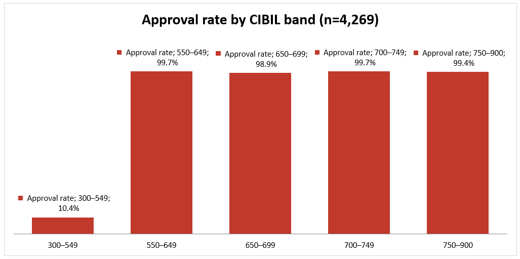
Below a CIBIL score of 550, only 10.4% of applicants get approved. Above 550? 99.7%. There is no slope between those bands — it’s a cliff. The lender’s decision is essentially one threshold on one number.

Below a CIBIL score of 550, only 10.4% of applicants get approved. Above 550? 99.7%. There is no slope between those bands — it’s a cliff. The lender’s decision is essentially one threshold on one number.

Finding 02 — among lower-score applicants, term length was the only escape hatch.

Finding 02 — among lower-score applicants, term length was the only escape hatch.

But the data had one more secret. [Chart: C2 — “For sub-550 applicants, loan term is the only escape hatch”] Among low-score applicants, short loans got approved about half the time — 47.6% for 2-year terms, 56.8% for 4-year terms. Every single request above 4 years? Zero approvals. 1,600 out of 1,600 rejected.


Read that again: the same person, the same lender — refused at 12 years, roughly a coin-flip at 4. The “yes” already existed. The interface just never mentioned it.

But the data had one more secret. [Chart: C2 — “For sub-550 applicants, loan term is the only escape hatch”] Among low-score applicants, short loans got approved about half the time — 47.6% for 2-year terms, 56.8% for 4-year terms. Every single request above 4 years? Zero approvals. 1,600 out of 1,600 rejected.


Read that again: the same person, the same lender — refused at 12 years, roughly a coin-flip at 4. The “yes” already existed. The interface just never mentioned it.

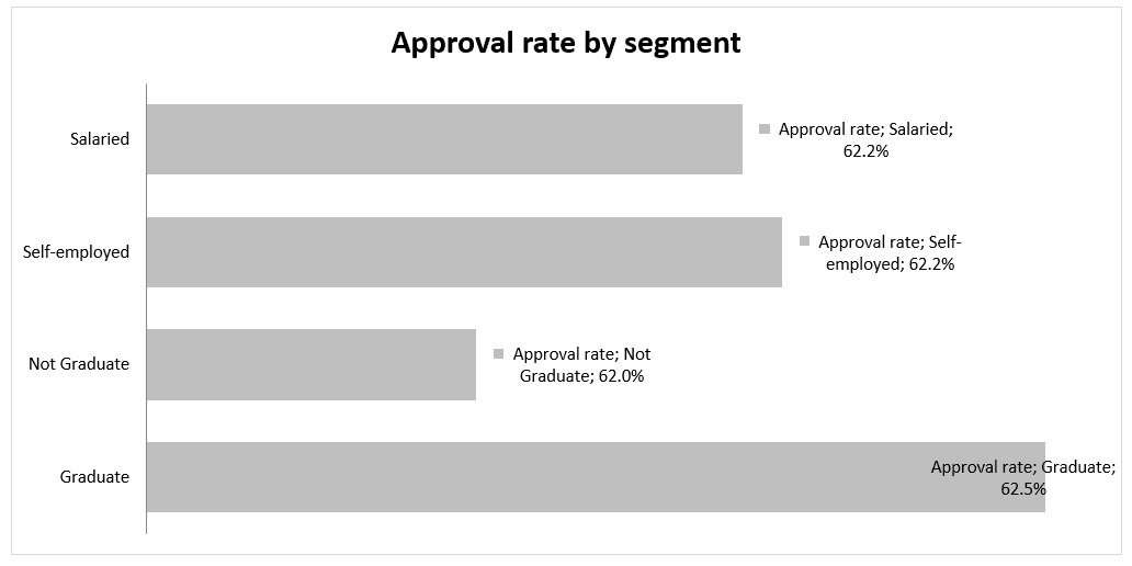
And the other twelve questions on the form? [Chart: C3 — "Education and employment type have zero effect"] Graduates get approved at 62.5%. Non-graduates at 62.0%. Self-employed and salaried are identical to the decimal: 62.2%. The form collects data the decision ignores.


Here’s the human cost hiding in those numbers: 42% of all applicants — 1,785 people — sat below the 550 line. 1,600 of them filled out the entire application anyway. Income proofs, asset declarations, employment details — 25 minutes of effort for an outcome that was decided before they typed a single field.

And the other twelve questions on the form? [Chart: C3 — "Education and employment type have zero effect"] Graduates get approved at 62.5%. Non-graduates at 62.0%. Self-employed and salaried are identical to the decimal: 62.2%. The form collects data the decision ignores.


Here’s the human cost hiding in those numbers: 42% of all applicants — 1,785 people — sat below the 550 line. 1,600 of them filled out the entire application anyway. Income proofs, asset declarations, employment details — 25 minutes of effort for an outcome that was decided before they typed a single field.

Why this matters beyond one dataset: rejection in the real world triggers a trap. When people get refused without explanation, they panic-apply elsewhere — and each new application triggers a hard inquiry that dents their score further. TransUnion CIBIL reported that consumers who applied for multiple loans within six months saw their scores drop by around 50 points on average. So the mystery rejection doesn’t just frustrate people. It actively makes their next rejection more likely.

Why this matters beyond one dataset: rejection in the real world triggers a trap. When people get refused without explanation, they panic-apply elsewhere — and each new application triggers a hard inquiry that dents their score further. TransUnion CIBIL reported that consumers who applied for multiple loans within six months saw their scores drop by around 50 points on average. So the mystery rejection doesn’t just frustrate people. It actively makes their next rejection more likely.

  1. User Stories

Priya
Priya spends 25 minutes on a 13-field application. Rejected — no reason given. She panics and applies at three more lenders. Each application dings her score. The system punishes her for not knowing how it works.

Problem statement 1: How might we intervene before effort is invested, and turn rejection into a recovery plan instead of a spiral?

Rajesh
Rajesh, CIBIL 492, asks for a 20-year home loan. Flat no. But the lender's own history says a 4-year term from someone like him gets approved 57% of the time. His "no" was really a "yes, but differently" — and nobody told him.

Problem statement 2: How might we convert dead-end rejections into viable alternatives the lender was already willing to approve?

Design principles

AI that explains itself without taking over

Before drawing screens, I wrote the AI a job description — because “add AI” is not a design decision.

The AI does exactly three jobs:

  • Predict — estimate approval likelihood from a soft credit check, before any effort

  • Search — scan the lender’s own approval history for the nearest viable alternative offer

  • Personalize — turn a rejection into an individual recovery plan, not generic credit tips


And it follows a behavioral contract:

  • It appears at exactly two moments (before the decision, after the decision). No chatbot. Otherwise invisible.

  • It says “unlikely,” never “you will be rejected” — because even the lowest band in the data gets approved 1 time in 10, and false certainty is a lie.

  • Every verdict names its main reason and the distance to the goal.

  • If it fails (say, bureau data is unavailable), the flow falls back to the normal application. The AI is a layer, never a gate..

I didn’t invent these rules. They operationalize three published playbooks — Microsoft’s HAX guidelines for human-AI interaction (tell people what the system can do and how sure it is; explain why it did what it did; let people fix things easily), Google’s People + AI Guidebook (set expectations early; explain with recourse; fail gracefully), and the Shape of AI pattern library (show what’s happening behind the scenes). Every screen decision below traces back to a named rule.

My position in one line: the best AI UX in lending is the kind you don’t see.

I didn’t invent these rules. They operationalize three published playbooks — Microsoft’s HAX guidelines for human-AI interaction (tell people what the system can do and how sure it is; explain why it did what it did; let people fix things easily), Google’s People + AI Guidebook (set expectations early; explain with recourse; fail gracefully), and the Shape of AI pattern library (show what’s happening behind the scenes). Every screen decision below traces back to a named rule.

My position in one line: the best AI UX in lending is the kind you don’t see.

Interface system

Design takeaways from heuristic analysis

Design takeaways from heuristic analysis

Flow 1 — The quick check. Three fields (amount, tenure, purpose), one consent, one soft credit check that leaves no mark. Thirty seconds later: an honest verdict in three bands — Strong, Possible, Unlikely — with the main factor named and the distance stated. One screen, three states, and the actions change with the verdict: Strong just continues; Possible continues with an “Improve chances” option; Unlikely leads with the recovery plan but never blocks the user — “Proceed anyway” is always there, because the prediction can be wrong..

Flow 1 — The quick check. Three fields (amount, tenure, purpose), one consent, one soft credit check that leaves no mark. Thirty seconds later: an honest verdict in three bands — Strong, Possible, Unlikely — with the main factor named and the distance stated. One screen, three states, and the actions change with the verdict: Strong just continues; Possible continues with an “Improve chances” option; Unlikely leads with the recovery plan but never blocks the user — “Proceed anyway” is always there, because the prediction can be wrong..

🟦 Guidelines in play — HAX G1 & G2 (show what the system can do, and how sure it is): verdicts are bands, never fake-precise percentages. PAIR · Mental Models: expectations set before effort. Shape of AI · Transparency: the visible “soft check — no inquiry recorded” working state.

🟦 Guidelines in play — HAX G1 & G2 (show what the system can do, and how sure it is): verdicts are bands, never fake-precise percentages. PAIR · Mental Models: expectations set before effort. Shape of AI · Transparency: the visible “soft check — no inquiry recorded” working state.

Flow 2 — The counteroffer. The user applies in full. If the answer is yes: approved, done. If the answer would be no, the engine searches for the nearest “yes” the lender’s own history supports — and the rejection and the alternative arrive as one composed message, never “REJECTED… but wait.” Two cards, identical rows, so the eye can compare straight down: the requested 20-year loan (EMI ₹26,660/month, total interest ₹38.98 lakh — not available today) versus the 4-year offer (EMI ₹64,300/month, total interest ₹5.87 lakh — likely approved). Both totals visible. The EMI more than doubles; the lifetime interest drops by ₹33 lakh. That’s a real trade-off, and showing both sides of it honestly is the whole point. One button pair: Accept 4-year offer / Decline.

Flow 2 — The counteroffer. The user applies in full. If the answer is yes: approved, done. If the answer would be no, the engine searches for the nearest “yes” the lender’s own history supports — and the rejection and the alternative arrive as one composed message, never “REJECTED… but wait.” Two cards, identical rows, so the eye can compare straight down: the requested 20-year loan (EMI ₹26,660/month, total interest ₹38.98 lakh — not available today) versus the 4-year offer (EMI ₹64,300/month, total interest ₹5.87 lakh — likely approved). Both totals visible. The EMI more than doubles; the lifetime interest drops by ₹33 lakh. That’s a real trade-off, and showing both sides of it honestly is the whole point. One button pair: Accept 4-year offer / Decline.

🟦 Guidelines in play — HAX G9 (support efficient correction): the counteroffer lets users redirect a failing request instead of restarting. HAX G11 (explain why): “Based on approval patterns for profiles like yours.” PAIR · Explainability + Trust: both options’ full costs shown — the AI proposes, the human decides.

🟦 Guidelines in play — HAX G9 (support efficient correction): the counteroffer lets users redirect a failing request instead of restarting. HAX G11 (explain why): “Based on approval patterns for profiles like yours.” PAIR · Explainability + Trust: both options’ full costs shown — the AI proposes, the human decides.

Flow 3 — The recovery plan. For the true “not today”: you’re 58 points away (492 → 550), here are two concrete steps in order, and one protective warning — please don’t apply elsewhere right now; each new application can push you further from the goal. The primary button on this rejection screen isn’t an exit. It’s “Remind me in 3 months” — a scheduled soft check, a way back. One design decision worth naming: the reminder schedules a notification, never a background check. Re-checking always requires a fresh tap from the user, and the reminder fires whether the news is likely good or bad — because silence must never carry meaning.

Flow 3 — The recovery plan. For the true “not today”: you’re 58 points away (492 → 550), here are two concrete steps in order, and one protective warning — please don’t apply elsewhere right now; each new application can push you further from the goal. The primary button on this rejection screen isn’t an exit. It’s “Remind me in 3 months” — a scheduled soft check, a way back. One design decision worth naming: the reminder schedules a notification, never a background check. Re-checking always requires a fresh tap from the user, and the reminder fires whether the news is likely good or bad — because silence must never carry meaning.

🟦 Guidelines in play — HAX G11 (explain why): the rejection names its factor and the exact distance. PAIR · Errors + Graceful Failure: a human advisor path on every automated “no”. HAX G10 spirit (scope actions when uncertain): re-checks always need a fresh user tap — consent has no memory.

🟦 Guidelines in play — HAX G11 (explain why): the rejection names its factor and the exact distance. PAIR · Errors + Graceful Failure: a human advisor path on every automated “no”. HAX G10 spirit (scope actions when uncertain): re-checks always need a fresh user tap — consent has no memory.

6. WHAT THE CRITIQUE CAUGHT

I didn't run usability tests in this one-week sprint — instead, every screen went through structured critique rounds, with Claude playing a skeptical senior design director against my drafts.

  • A reassurance that outlived its truth. "This won't affect your CIBIL score" was true for the soft check — and then my wireframe repeated it under the button that starts the formal credit check. Caught, and replaced with the honest version: "Continuing includes a formal credit check."

  • A verdict that looked like a toggle. My first "Possible" result was a pill that looked draggable — users would try to slide it to a better answer. It became a segmented three-band scale: you're in a band, not at a point. (A speedometer gauge iteration in between got killed for the same reason — a needle implies precision the system honestly doesn't have.)

  • My own numbers contradicting each other. A nudge said "reduce tenure to 10 years" while the data — and my own counteroffer — said 4. In a case study about honest systems, that one line would have sunk the whole argument.

  • A cross-sell in a vulnerable moment. An early recovery screen promised "premium card offers" to someone who'd just been refused a home loan. Deleted. The recovery plan serves exactly one goal: this user's loan.

  1. HOW WE'D KNOW IT WILL WORK

Wasted effort. Today, 37% of all applications (1,600 of 4,269) were fully completed by people with effectively zero chance. The quick check should take that to near zero — a 25-minute doomed form becomes a 30-second honest answer.

Rejections turned into offers. Today: 0% — every no is terminal. The lender's own history shows roughly half of short-tenure requests from the at-risk segment get approved, so every counteroffer accepted is business the current journey throws away. Even 15–20% acceptance is net-new lending built on honesty.

The trap, defused. Fewer rejected users triggering new hard inquiries within 30 days (recovery-plan viewers vs. non-viewers is a natural comparison during rollout). And the strongest trust signal of all: how many rejected users come back in 3 months when reminded. A refused customer who returns is telling you the rejection was handled right.

reflection

This is one lender, one product, and behavioral data without qualitative validation — in a real engagement, user interviews would be step one, and I'd expect them to complicate the clean story the numbers tell. The dataset itself is almost certainly simplified or synthetic — real underwriting has exceptions, overrides, and noise; a 0%-to-100% jump between adjacent score bands is too clean for reality. I treated it as a design probe: one lender's revealed policy, not universal truth.

Thank you for viewing

©2024 All Rights Reserved by Siddharth Gore Design

Create a free website with Framer, the website builder loved by startups, designers and agencies.