UX/UI/Mobile Application
UX/UI/Mobile Application
Scan2Go
Scan2Go
Goal
Goal
Redesign and launch Scan to Go, an application designed to improve food ordering process and streamline order management for restaurants and cafes, making it easier to receive and track online orders, particularly during high-demand periods.
Redesign and launch Scan to Go, an application designed to improve food ordering process and streamline order management for restaurants and cafes, making it easier to receive and track online orders, particularly during high-demand periods.
Outcome
Outcome
Implemented Scan to Go, enabling restaurants and cafes to seamlessly accept and manage online orders, significantly reducing the manual effort required to track orders during peak hours.
Implemented Scan to Go, enabling restaurants and cafes to seamlessly accept and manage online orders, significantly reducing the manual effort required to track orders during peak hours.
Time Period
Time Period
6 Months
Design process
Design process
Competitor Analysis, Information Architecture, Usability testing, Wireframing, Prototyping
Competitor Analysis, Information Architecture, Usability testing, Wireframing, Prototyping
Why Redesign
Why Redesign
During the pandemic the restaurants preferred to reduce the contact while ordering. Scan2go is an app which focuses on reducing the contact while ordering food in cafes and restaurants. The app was previously designed by our coding team due to which they missed some crucial points while designing the app. I along with my colleague went through the app and felt redesigning would provide a good experience to the user. That is why we decided to redesigned the whole app.
During the pandemic the restaurants preferred to reduce the contact while ordering. Scan2go is an app which focuses on reducing the contact while ordering food in cafes and restaurants. The app was previously designed by our coding team due to which they missed some crucial points while designing the app. I along with my colleague went through the app and felt redesigning would provide a good experience to the user. That is why we decided to redesigned the whole app.


Competitor Analysis
Competitor Analysis
Competitive analysis helped us in seeking the services provided by most of the apps. According to the competitor analysis we found that there are multiple web apps providing service to order food in store. We also understood the way they designed the UI. So we, tried to improve the usability by providing features such which would make our app stand out
Data analysis of their sales
Providing an easy way to download monthly invoice
Providing order monitoring
Providing Multiple Payment methods

Information Architecture
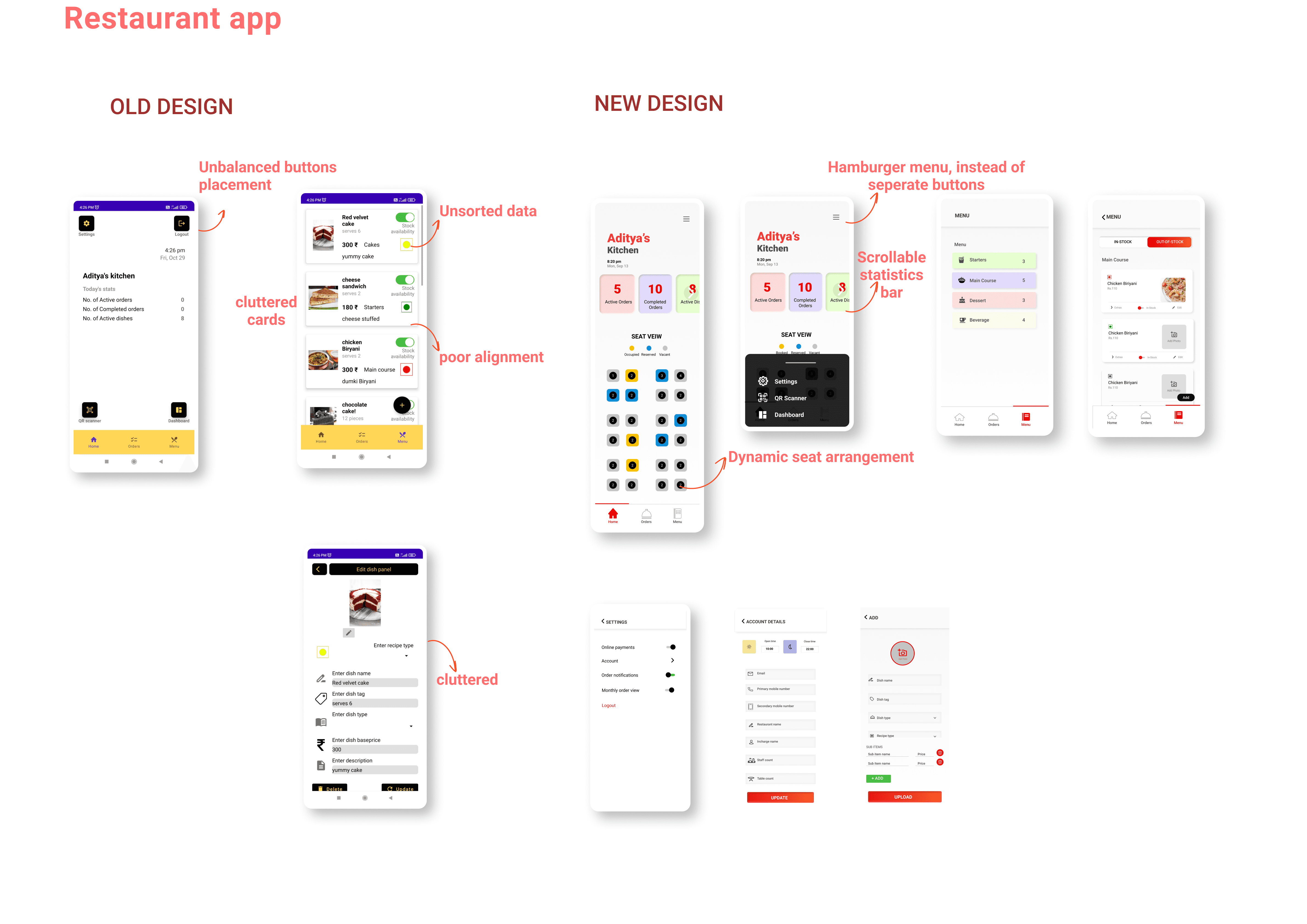
We restructured the information architecture to create a more intuitive and user-friendly experience, ensuring that content is logically organized and easily accessible. By simplifying navigation and categorizing information based on user needs, I reduced the time users spent searching for key information and improved overall engagement.
We restructured the information architecture to create a more intuitive and user-friendly experience, ensuring that content is logically organized and easily accessible. By simplifying navigation and categorizing information based on user needs, I reduced the time users spent searching for key information and improved overall engagement.
The first image depicts the original information architecture, while the second image illustrates the new and enhanced structure for the restaurant management application.
The first image depicts the original information architecture, while the second image illustrates the new and enhanced structure for the restaurant management application.


Usability Testing
Usability Testing
I created a working prototype on Figma which we used for usability testing on the restaurant staff and get the review from them about the design and working of the app. We tested the prototype by watching them use the app on the phone in their own cafes and restaurants. By doing usability testing we understood some points in design which needed some changes.
I created a working prototype on Figma which we used for usability testing on the restaurant staff and get the review from them about the design and working of the app. We tested the prototype by watching them use the app on the phone in their own cafes and restaurants. By doing usability testing we understood some points in design which needed some changes.
Usability testing questions
Open the app and login
After you login check account details
Check not active orders by going in the orders tab
Suppose you think of adding a new dish in the menu how will you do it
If you want to edit the dish then, how will you do it and update it
How will you change the timings of the restaurant from the settings
What is difficult for you to find on the page
What did you find confusing
Did you like the new design and the use of colors.
How was your experience while adding and editing dishes
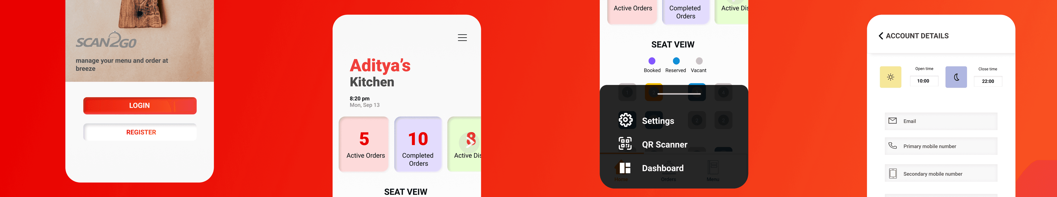
Final UI Design
Final UI Design
Final UI Design

conclusion
conclusion
By applying an iterative design approach, I refined user engagement and task achievability, which ultimately expanded the customer base by 30%. I see this as a significant step toward achieving an overall improved user experience.
Gamification techniques can be helpful and engaging for users if designed the right way.
Users found the newly designed app engaging and easy to understand and thought the rewards were meaningfully designed enhancing the usability of gamification techniques
reflection
reflection
I thoroughly enjoyed working on this project. Initially, my focus was solely on identifying flaws in the old design and redesigning it, but as I delved deeper, I realized there was much more to consider.
Throughout the project, I prioritized usability testing, which revealed small but significant issues that users encountered. I learned that people don't always behave as they intend, so observing them interact with the app provided invaluable insights. I also gained a deeper understanding of the importance of collaborating with colleagues across different departments, taking into account their perspectives and constraints.
Designing is an ongoing process, always evolving. I recognize that there's still room for improvement, and I'm committed to iterating further, refining the design, and moving closer to an even better solution. This has been my approach to redesigning this wonderful app, and I look forward to continuing the journey.
I thoroughly enjoyed working on this project. Initially, my focus was solely on identifying flaws in the old design but as I delved deeper, I realized there was much more to consider. Throughout the project, I prioritized usability testing, which revealed small but significant issues that users encountered. This has been my approach to redesigning this wonderful app, and I look forward to continuing the journey.
Thank you for viewing